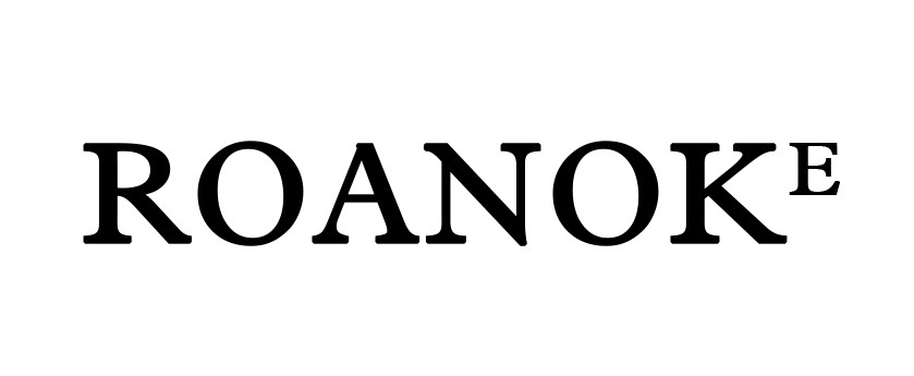
Starting point. I chose this serif font to start working on the logo design. I already knew I'd like to reduce the E, as a sort of apex.
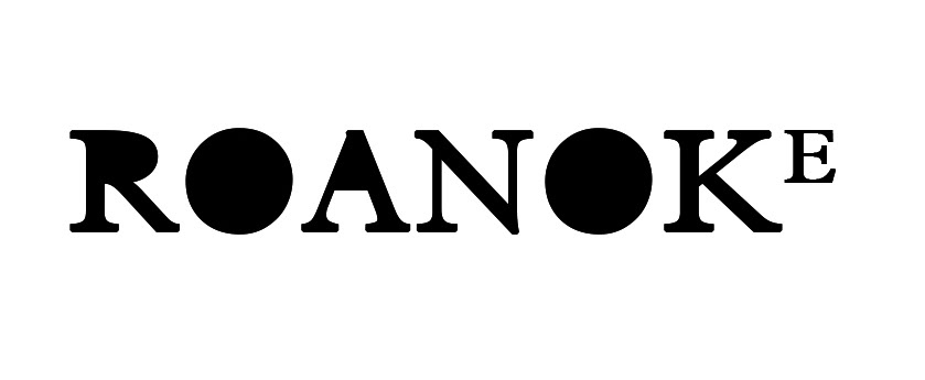
I tried to fill the empty spaces, just to play with the weight of the different letters.
Phase two. I started to add some "ink" and "typewrite" effects to make the design more dirty. Then I reduced the A, too, ad I designed the two O with an Illustrator vectorial brush. The idea was to make the two letters look like a sort of eclipse. I also decided to play with kerning, especially with the two little letters, to add something disturbing to the desing.
(I usually like to immediately verify if the inverted design works too.So, for this kind of logos, I work on B/N and N/B at the same time).
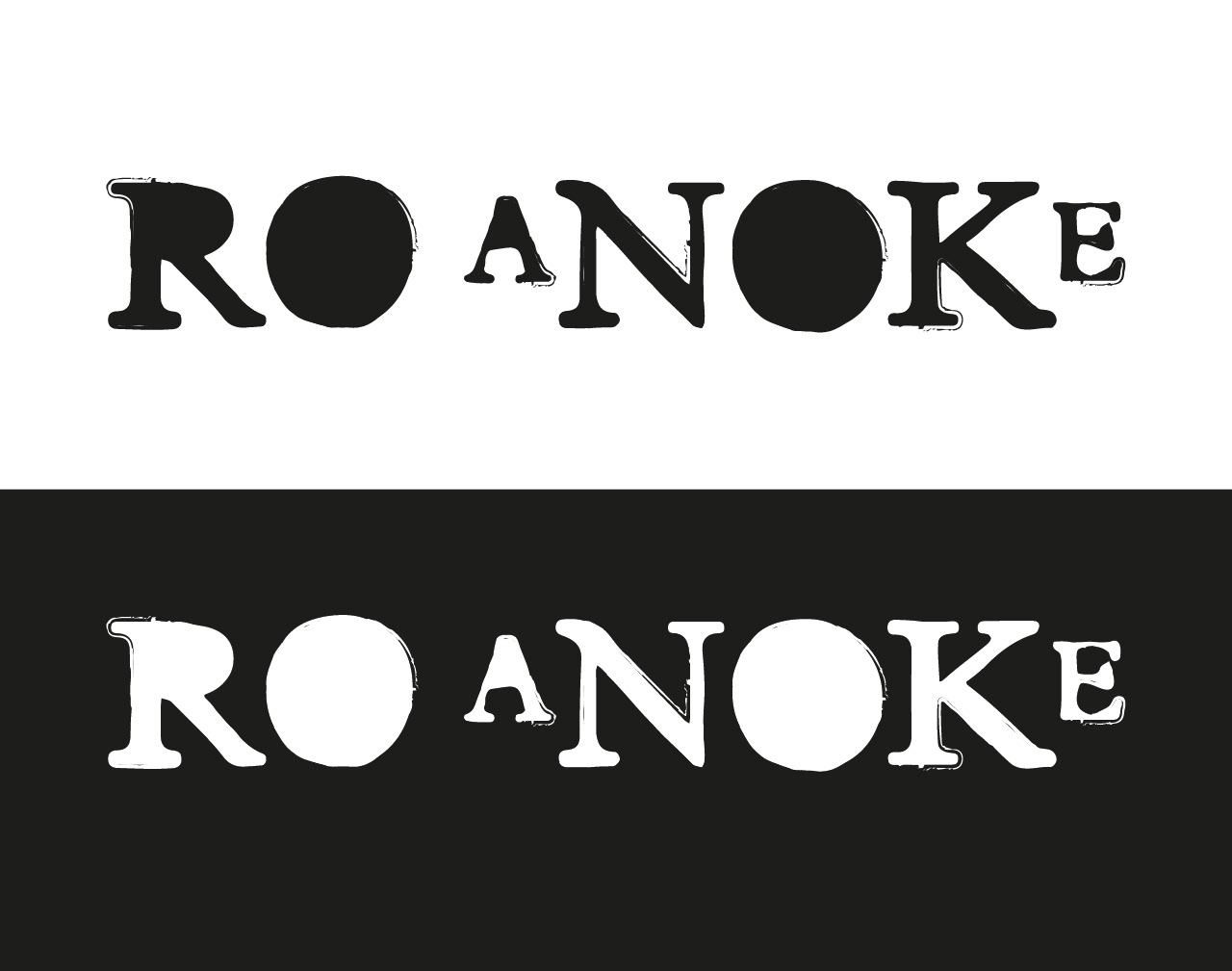
Same design, but filled. Not so convincing.
Here I tried to use another dirtier brush. I also tried to redesign the O. I didn't like the general weight of this version of the logo, anyway I kept the to different O.

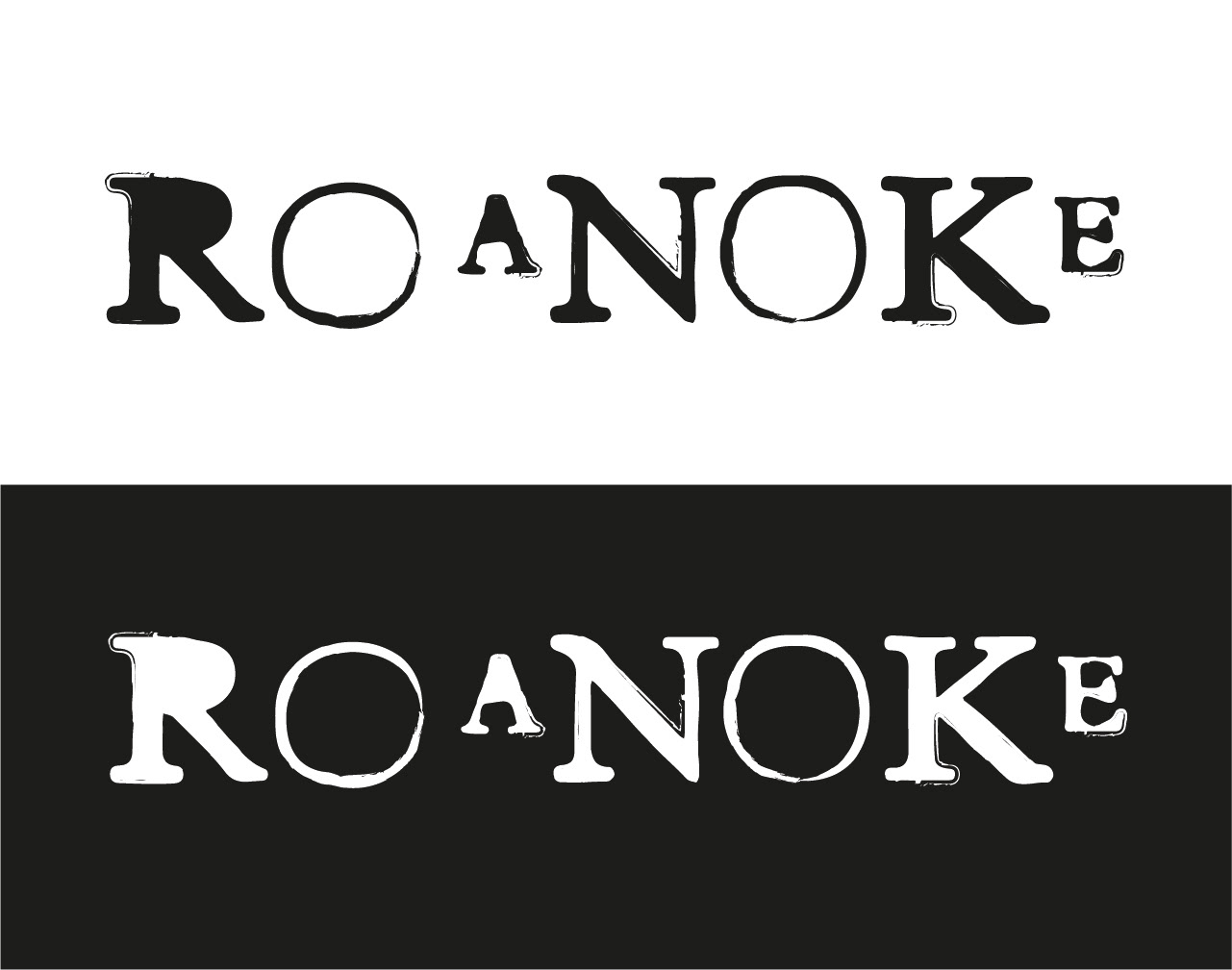
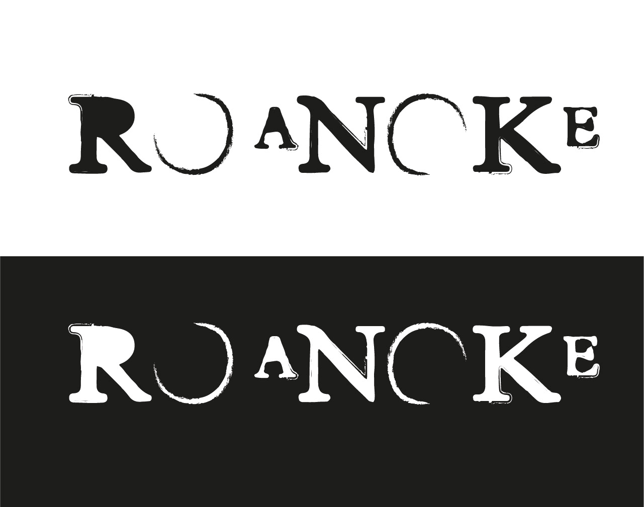
Here the final version! I preferred this brush, but also the two different "eclipse phases" for the O and this kerning solution.
The official logo will probably be the black one.